Bubble chart is also known as a packed bubble chart in tableau. It is used to show data in bubbles or filled color circle with various sizes. If you wish to display your data in the formed cluster of circles, then the bubble chart is the best option for you. Every value in the dimension field denotes a circle, although the amounts of measure represent the size of those circles. As the values are not going to be presented in any row or column, you can drag the required fields to different shelves under the marks card.
For example, if we use the Sample-superstore to find the size of profits for different ship mode, we will need to follow these steps.
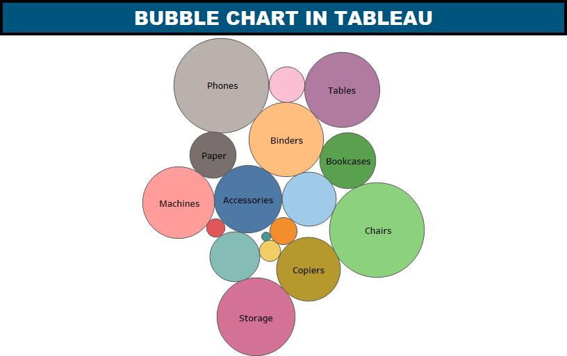
Step 1 − Drag and drop the measure profit into the Size shelf under Marks card.
Step 2 − Drag and drop the dimension sub-category into the Labels shelf under Marks card.
Step 3 − Pull the dimension sub-category to the Colors shelf under Marks card.
If you drag the sales measure into the Labels shelf, you can display the values of the measure field, which decides the size of the circles. This is what you get if you follow the above steps:
While creating bubble charts, we need to understand that they can become a point of trouble to interpret when the magnitude differences in the bubble data elements are too significant.
Also, Try answering these Tableau multiple-choice questions quiz and exams to test your skills in the Tableau.
- Tableau Desktop Specialist Practice Questions for Global Certification (Practice quiz)
- Tableau Desktop Specialist (Practice Exams)
If you have any questions, please shoot an email to info@datavizguru.com