

A scatter plot is used to compare two measures. It shows many points scattered in the Cartesian plane. Many insights of the data set can be expressed through the use of shape, color, and size within the scatter plot. To create a scatterplot one can use numerical variables as X and Y coordinates. To create a scatter plot, Tableau requires a minimum of two measures, one in the Rows shelf and one in a Columns shelf. We can also add dimension fields to the scatter plot, which helps us in marking different colors, shapes & sizes of data points in the scatter graph.
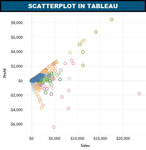
Let’s create a scatterplot by using Sample Superstore data in tableau to compare the sales and profit of the customers.
Steps to create a scatterplot in tableau:
Drag and drop the Sales from measures to the Columns shelf.
Drag and drop the Profit from measure to the Rows shelf.
Pull the dimension Customers to the details Shelf under Marks.
You can also use dimension Sub-Category to the color Shelf under the Marks card. This chart shows the scatter points of all the customers within each subcategory of a different color. Once we follow the steps we will get the scatterplot.


One Reply to “Scatter Plot : Creation & Importance”