
A bar chart or graph is used to represent category wise data in the form of bars. The length of the bars is proportionate to the value that each category represents. This gives us a pictorial representation of data in a simple form. In Tableau, when you drag a dimension to the Row shelf and measure to the Column shelf, it automatically produces a bar chart. You can create the bar chart by using the bar chart option present in the Show Me button. Tableau is an intelligent tool and in case the data is not suitable for a bar chart to be created then this option will be greyed zoned.
In Tableau, we can create different bar charts by using a Dimension & a Measure. Adding colour, labels and details may give us various insights.
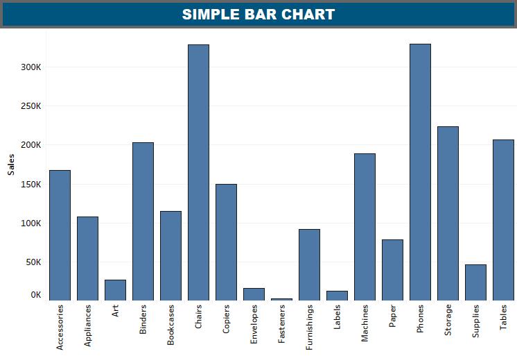
Below is the image of a simple Bar chart in tableau.
IMPORTANCE OF BAR CHART
A Bar chart is useful whenever you want to show data points across different subcategories of the data and it is also useful to compare metric values across groups. We can also get to know which elements show the highest or lowest values. Bar chart tells us how other categories or subcategories compare against each other.
A bar chart is also called a Column chart. We can use vertical bars and horizontal bars to show data points along X-axis and a Y-axis. Each bar represents one value. In this visualization, bars are stacked to one another.

Simple Bar Chart
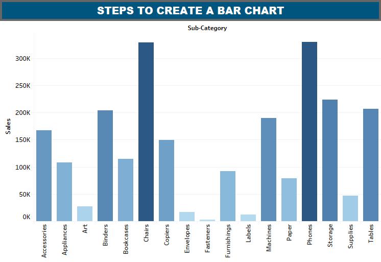
Lets us take Sample-Superstore from tableau and create a Bar chart step by step, First, you need to choose the dimension, let’s say Subcategory (For Ex) take it to the columns shelf and Sales to the Rows shelf. It will produce a vertical bar chart, if it does not, you can choose the chart type from the Show Me tool.
You can apply colours of your choice to the bars based on their ranges. The longer bars get darker shades as compared to the smaller bars. For this, you need to drag the sales field to the color palette under the Marks Pane.
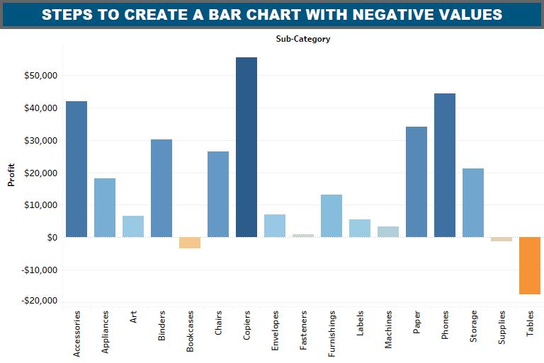
 So what do you think it will do if you use a measure that contains values which are negative. It will display a different colour for negative bars. Here we have Profit in rows and it contains negative values:
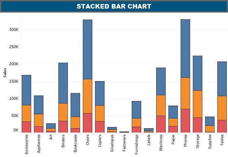
 Stacked Bar Chart
A stacked bar chart is a single bar that is divided into varied segments that are stacked one upon the other. The size of each stacked section depends on the value corresponding to that section. Also, each section in one stack is allocated a distinct colour. All you need to do is, drag the dimension Sub-Category into column and Sales into rows, this will create a bar chart and afterwards add the field named segment to the Marks pane and drop it in colours section. In the resultant chart, you will see the distribution of each segment in each bar. See below
In this article, we have learnt about the bar charts and its variants. I hope that this Tableau Bar chart article has given you an insight into Bar charts.


Found it very useful for Tableau beginners, Thanks Baldev for providing such a detailed oriented explanation on Tableau Barchart. I am sure it will also help me with my Tableau certification exam.